Sunday, November 20, 2016
Algebra
Sites to practise
http://www.mathgoodies.com/lessons/vol7/equations.html
https://www.ixl.com/math/algebra-1/write-variable-equations
https://www.ixl.com/math/grade-4/write-variable-equations-to-represent-word-problems
Describing Graphs


http://www.mathsisfun.com/data/images/bar-chart-movies.gif
Friday, November 18, 2016
Line Graphs
The line graph below shows people in a store at various times of the day. (Title)

http://www.mathgoodies.com/lessons/graphs/line.html
http://www.mathgoodies.com/lessons/graphs/line.html ( to practise)
A graph that uses points connected by lines to show how something changes in value (as time goes by, or as something else happens).
https://www.mathsisfun.com/definitions/line-graph.html
Wednesday, November 9, 2016
Summarizing graphs.
Homework
Summarize the graph below.
It is based on a survey of 70 students.

| |
F.P.
|
Sunday, November 6, 2016
Summarizing Graphs
The graph used is a pie chart and shows the eye colour of students in a class. The chart considers three colours of eyes: brown, blue and green.
The graph shows that half of the students in the class have blue eyes. The other half of the class have brown or green eyes. However, there are more students with brown eyes than green eyes.
In conclusion, the majority of students have blue eyes, followed by brown eyes and the fewest students have green eyes.

The graph used is a bar chart and shows how long animals can hold their breath. It considers whales, dolphins and seals. The time used is minutes and the range is gfrom 0 to 20 minutes.
From the graph we can see that whales can hold their breath for almost 20 minutes, Dolphins can hold their breath for 12 minutes and seals for 7 minutes.
In conclusion, whales can hold their breath for the longest period and seals for the shortest period.
Images: google images
Text: elaborated by S.Isolica
Describing Graphs
1 Introduction (Here you say what the diagram is about. )
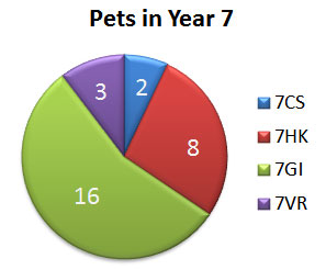
The pie chart is about the pets in Year 7. The chart is divided into 4 parts and each part represents one class of Year 7.
2 Message of the diagram
The largest number of pets are in form 7GI. There are 16 pets.
The second largest number of pets are in form 7HK. There are 8 pets.
So there are more than twice as many pets in form 7GI.
The chart shows that there are only 2 pets in form 7CS and 3 in form 7VR.
The second largest number of pets are in form 7HK. There are 8 pets.
So there are more than twice as many pets in form 7GI.
The chart shows that there are only 2 pets in form 7CS and 3 in form 7VR.
3 Conclusion
So we can say that the most pets of Year 7 are in form 7GI and the least in form 7CS. There are more than 50 per cent of all the pets in one form - form 7GI.
Summary
The pie chart is about the pets in Year 7. The chart is divided into 4 parts and each part represents one class of Year 7.
The largest number of pets are in form 7GI. There are 16 pets.
The second largest number of pets are in form 7HK. There are 8 pets.
So there are more than twice as many pets in form 7GI.
The chart shows that there are only 2 pets in form 7CS and 3 in form 7VR.
The second largest number of pets are in form 7HK. There are 8 pets.
So there are more than twice as many pets in form 7GI.
The chart shows that there are only 2 pets in form 7CS and 3 in form 7VR.
So we can say that the most pets of Year 7 are in form 7GI and the least in form 7CS. There are more than 50 per cent of all the pets in one form - form 7GI.
Source:
http://www.englisch-hilfen.de/en/words/charts.htm

Subscribe to:
Posts (Atom)